Select
The Select control is based on the HTML <select> tag. It allows selecting an option from a drop-down list of options. You can fill Select with options in a handy way, specify the selected value, add a label or a placeholder for the connected text field, initialize a disabled select, provide error styling for form validation.
Related resources
- Get the widget by installing the
@svar-ui/svelte-corepackage. - Check Select API Reference to see the list of configuration properties.
- Explore the samples to visualize the available features.
Initialization
To create a Select instance on a page, you need to complete two steps:
- import the source file of the control on a page:
<script>
  import { Select } from "@svar-ui/svelte-core";
</script>
- use the
<Select>tag to initialize the control:
<Select />
The default select is initialized with no options.
Loading options
You can add options into Select on its initialization or after it. To begin with, you need to define a data set.
Preparing a data set
A data set will contain Select options. You need to specify them as objects with properties presented as key:value pairs. Below you can see an example data set which contains a list of users:
const users = [
    {
        id: 87,
        label: "Berni Mayou",
        email: "bern.mayour@mail.com"
    },
    {
        id: 97,
        label: "August Dvorak",
        email: "dvor.august@gmail.com"
    },
    {
        id: 98,
        label: "Elly Soyer",
        email: "elly.soyer@example"
    }
 ]
Loading options on initialization
To load a prepared data set on initialization of Select, you should use the options property:
<script>
  const users = [
    {
        id: 87,
        label: "Berni Mayou",
        email: "bern.mayour@mail.com",
    },
    // more options
  ]
</script>

<Select options={users} />
Loading options after initialization
You can load options into Select after its initialization from a separate JS file. First, prepare a file with data, name it "userlist" and export the desired data set:
export const users = [
  {
        id: 87,
        label: "Berni Mayou"
    },
    {
        id: 97,
        label: "August Dvorak"
    },
    {
        id: 98,
        label: "Elly Soyer"
    }
]
When a data set is ready, you can import it into your application and set the name of the data set as a value of the options property:
<script>
  import { Select } from "@svar-ui/svelte-core";
  import { users } from "../your_data/userlist";
</script>

<Select options={users} />
Related sample: Select
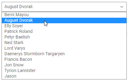
Setting the value
You can specify which one of the provided options should be rendered in the input field of the control. Use the value property to set the id of the selected value:
<script>
  const dataset = [
    {id: 1, label: "First option"},
    {id: 2, label: "Second option"},
    {id: 3, label: "Third option"}
  ]
</script>

<Select options={dataset} value={1} />
If the value isn't set, the text field will be rendered empty. Here's where a placeholder may be useful.
Related sample: Select
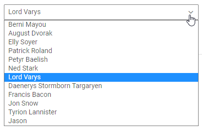
Getting the current value
You can get the value of the option selected at the moment. For this, you need to:
- specify a variable that will contain the Select value (it may contain the initial value):
<script>
    import { Select } from "@svar-ui/svelte-core";

    const dataset = [
        {id: 1, label: "First option"},
        {id: 2, label: "Second option"},
        {id: 3, label: "Third option"}
    ]

    let selected = 2;
</script>
- bind the variable to the
valueproperty of the control:
<Select options={dataset} bind:value={selected}/>
If the name of the variable matches its value, you can use the shorthand while binding the property:
<script>
    import { Select } from "@svar-ui/svelte-core";

    const dataset = [
        {id: 1, label: "First option"},
        {id: 2, label: "Second option"},
        {id: 3, label: "Third option"}
    ]

    let value = 2;
</script>

<Select options={dataset} bind:value/>
After that the value assigned to the bound variable will be updated on each change of the selected option.
Related sample: Select
Catching the change of the selected option
In case you need to catch the change of the selected option, you can do it by handling the change event. Inside the event you can get the value of the newly selected option in the following way:
<script>
  function handleChange({value}) {
       console.log(value);
       // id of a new selected option
  }
</script>

<Select options={dataset} onchange={handleChange}/>
The handler function of the change event takes an object with an id of the newly selected option.
Configuring the text of the selected option
You can specify the text of which field to show in the input for the selected option. To complete this task, use the textField property. As a value of this property you need to set the key of the field, the text of which you want to display in the input when the option is selected. The default value is "label".
<script>
  const users = [
    {
       id:1,
            label: "Berni Mayou",
            email: "bern.mayour@mail.com",
        },
        {
          id:2,
            label: "August Dvorak",
            email: "dvor.august@gmail.com",
        },
        {
          id:3,
            label: "Elly Soyer",
            email: "elly.soyer@example",
        }
  ]
</script>

<Select options={users} textField="email" />
In the above example the list of options displays the values of the label attributes. The textField property defines that the value of the email attribute is shown in the text field on selection of an option from the list.
Related sample: Select
Adding the Clear button
The Clear button allows clearing the selected option from the control's input.

To add the Clear button into the input, use the clear property:
<Select options={users} clear />
Related sample: Select
Adding a title
A title is a tooltip text that appears on hovering the mouse cursor over the input and may contain some extra information about the control. Use the title property to add a tooltip for a select:
<Select error options={users} title="Invalid option" />

Related sample: Select
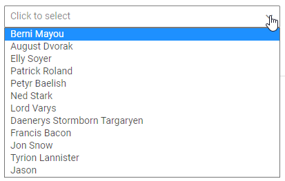
Adding a placeholder for the text field
You can add a placeholder inside the text field of Select. The placeholder can contain some prompting message to make interaction with the control simpler. To set the text of a placeholder, use the placeholder property:
<Select placeholder="Select an option"/>
For a placeholder to be visible in the input, a select should be initialized without the initial value specified.
Setting the disabled state
Whenever you need to render a disabled select, you can do it with the help of the disabled property set to the true value:
<Select disabled={true}/>
It is also possible to set a select to the disabled state by declaring the property with no value:
<Select disabled />

Related sample: Select
Adding a label
A default select has no label. To add it, you can use the Field component and complete several steps:
- include the Field source file on a page, declare the
<Field>tag and complete it with the necessary props:- add a desired label via the
labelproperty - optionally, set the
position="left"property, if you want to place the label to the left of the select
- add a desired label via the
<script>
  import { Select, Field } from "@svar-ui/svelte-core";
</script>

<Field label="Details" position="left" />
After that, wrap the select into the <Field> tag. The Field component automatically generates an id for the inner control, which creates label-input association.
<Field label="Details" position="left">
  <Select />
</Field>
Related sample: Select
Styling an option validation error
When you use a select inside a form and a wrong option value is passed to the control, you can use error styling to show that validation has failed. Once you've set the error property to true (or just specified the property without a value):
<Select error={true}/>
the input's border and the option's text become red. To make the label red as well, use the error property of the Field control.
<script>
  import { Select, Field } from "@svar-ui/svelte-core";
</script>

<Field label="Error" error>
  <Select error />
</Field>

Related sample: Select