Calendar
The Calendar control provides your users with the ability to select dates at ease. You can supply your calendars with handy buttons, apply the necessary language to their interface and make use of some custom logic to select a particular date range.
Related resources
- Get the widget by installing the
@svar-ui/svelte-corepackage. - Check Calendar API Reference to see the list of configuration properties and events.
- Explore the samples to visualize the available features.
Initialization
To create a Calendar instance on a page, you need to complete two steps:
- import the source file of the control on a page:
<script>
  import { Calendar } from "@svar-ui/svelte-core";
</script>
- apply the
<Calendar>tag to initialize a calendar:
<Calendar />
A default calendar displays the current date (opens at the current month and year) without any settings added.
Setting the value
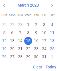
You can select a particular date in Calendar. Use the value property for this purpose. As a value, it awaits the Date object:
<Calendar value={new Date(2023, 2, 15)} />
Pay attention that months' enumeration starts with 0.
Calendar will show the specified date with the day highlighted, if visible.

Related sample: Calendar
Getting the current value
You can get the current value of the calendar. For this, you need:
- specify a variable that will contain the value of the control (it may contain the initial value):
<script>
  import { Calendar } from "@svar-ui/svelte-core";

  let date = new Date(2023, 3, 18);
</script>
- bind the variable to the
valueproperty of the control:
<Calendar bind:value={date} />
If the name of the variable matches its value, you can use the shorthand while binding the property:
<script>
  import { Calendar } from "@svar-ui/svelte-core";

  let value = new Date(2023, 3, 18);
</script>

<Calendar bind:value/>
After that the value assigned to the bound variable will be updated on each change of the date in the calendar.
Catching the change of the selected date
In case you need to catch the change of the selected date, you can do it by handling the
change event. Inside the event it's possible to get the newly selected date in the following way:
<script>
  function handleChange(ev){
       const newValue = ev;
       console.log(newValue);
       // =>{value: Thu Apr 20 2023 00:00:00 GMT+0300}
  }
</script>

<Calendar onchange={handleChange}/>
Showing the specified date
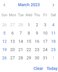
You can show a particular date in the calendar. Use the current property for this purpose. Property accepts Date object as value.
<Calendar current={new Date(2023, 2, 15)} />
Calendar will open at the specified date without highlighting the day:
Related sample: Calendar
Highlighting a date range
You can easily mark a range of days in the calendar. What you need to do is:
- define the logic of a date range selection in a function and point to your function inside the
markersproperty:
<script>
  const markLine = v =>
    v >= new Date(2022, 2, 13) && v <= new Date(2022, 2, 19)
      ? "inrange"
      : "";
</script>

<Calendar markers={markLine} />
The function passed as a value of the markers property takes one parameter:
dateRange- a range of dates to be marked
and must return a string with the name of the CSS class or an empty string.
- to make the marked range visible in Calendar, set the corresponding date through the
currentproperty:
<script>
  const markLine = v =>
    v >= new Date(2022, 2, 13) && v <= new Date(2022, 2, 19)
      ? "inrange"
      : "";
</script>

<Calendar current={new Date(2022, 2, 18)} markers={markLine} />
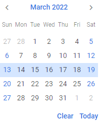
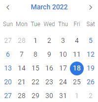
The result of highlighting a date range is given below:
Related sample: Calendar
Localizing Calendar
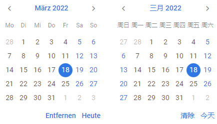
You can easily change the language of Calendar labels which are the names of months and days as well as the buttons' labels with the help of the predefined API. There are 9 locales provided together with the English one.
Setting the default locale
By default, Calendar interface uses the English locale. Here's the default locale object:
const calendar = {
  monthFull: [
    "January",
    "February",
    "March",
    "April",
    "May",
    "June",
    "July",
    "August",
    "September",
    "October",
    "November",
    "December",
  ],
  monthShort: [
    "Jan",
    "Feb",
    "Mar",
    "Apr",
    "May",
    "Jun",
    "Jul",
    "Aug",
    "Sep",
    "Oct",
    "Nov",
    "Dec",
  ],
  dayFull: [
    "Sunday",
    "Monday",
    "Tuesday",
    "Wednesday",
    "Thursday",
    "Friday",
    "Saturday",
  ],
  dayShort: ["Sun", "Mon", "Tue", "Wed", "Thu", "Fri", "Sat"],
  hours: "Hours",
  minutes: "Minutes",
  done: "Done",
  clear: "Clear",
  today: "Today",
  am: ["am", "AM"],
  pm: ["pm", "PM"],

  weekStart: 7,
  clockFormat: 24,
};
Changing the locale
To apply a different locale to the Calendar, you should:
- import the Locale object:
<script>
  import { Calendar, Locale } from "@svar-ui/svelte-core";
</script>
- include the necessary locales package on a page:
<script>
  import { Calendar, Locale } from "@svar-ui/svelte-core";
  import { de, cn } from "@svar-ui/core-locales";
</script>
- wrap the necessary Calendar instance into the
<Locale>tags and use thewordsproperty to set the locale of choice. The example below shows calendars with labels in German and Chinese, correspondingly:
<h4>Calendar with Locale</h4>
<div style="display: flex; flex-direction: row;">
  <Locale words={de}>
    <Calendar value={new Date(2022, 2, 18)} />
  </Locale>
  <Locale words={cn}>
    <Calendar value={new Date(2022, 2, 18)} />
  </Locale>
</div>

Related sample: Calendar
Configuring header format
To redefine the format for headers in Calendar, change the values of the monthYearFormat and yearFormat parameters in the formats object of the words property. To see default values for the English locale, refer to Localization.
Example for the Chinese locale:
<Locale
  words={{
    ...cn,
    formats: {
      ...cn.formats,
      monthYearFormat: "%Y年%F",
      yearFormat: "%Y年",
    },
  }}
>
  <Calendar value={new Date(2022, 2, 18)} />
</Locale>
Related sample: Calendar
Configuring buttons
Hiding the buttons
A default Calendar has two handy buttons in the lower part. A click on the Today button highlights the today's date and shows it in the calendar. The Clear button helps to discard date selection and reverts the calendar to the default state.
If needed, you can switch those buttons off. Set the buttons property to false to achieve this purpose:
<Calendar value={new Date(2022, 2, 18)} buttons={false} />
Related sample: Calendar
Enabling individual buttons
You can also enable only specific buttons instead of the default set. To do this, pass an array of button names to the buttons property. Possible values in the array are "clear", "today".
For example, to show only the Clear button:
<Calendar value={new Date(2022, 2, 18)} buttons={["clear"]} />
Creating a separate Month view
The Month control presents a separate view of the Calendar month. It will be useful when you need to render a single month or several months in your app.

Related resources
- Get the widget by installing the
@svar-ui/svelte-corepackage. - Check Month API Reference to see the list of configuration properties.
- Explore the samples to visualize the available features.
Initialization
To initialize a Month instance on a page, you need to complete the steps below:
- import the source file of the control on a page:
<script>
  import { Month } from "@svar-ui/svelte-core";
</script>
- use the
<Month>tag to render a month on a page:
<Month />
A default month view displays the current date (opens at the current month) without any settings added.
Selecting a date range
You can select a particular date range both in one month or in several months in a row.
The value property is used for specifying a selected date range. As a value, it awaits an object with the start and end dates of the range to be selected.
In a month
For selecting a date range in an independent month view, use the value property as in:
<Month
  current={new Date(2022, 4, 1)}
  value={{ start: new Date(2022, 4, 4), end: new Date(2022, 4, 6) }} >
</Month>
In several months
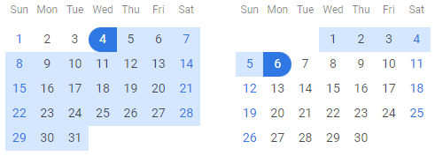
For displaying a date range that includes several months, set the same start and end dates via the value property of all the rendered months. For example:
<Month
  current={new Date(2022, 4, 1)}
  value={{ start: new Date(2022, 4, 4), end: new Date(2022, 5, 6) }} />
<Month
  current={new Date(2022, 5, 1)}
  value={{ start: new Date(2022, 4, 4), end: new Date(2022, 5, 6) }} />
Selecting a single day
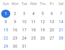
If you need to show a single day in the Month view, you need to use the value property. Set it to specific date by providing a Date object:
<Month value={new Date(2022, 4, 1)}/>
This is what a Month view with a single selected date looks like:
Showing the specified month
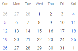
You can render a particular month. Use the current property for this purpose. As a value it accepts a Date object:
<Month current={new Date(2023, 2, 18)} />
The corresponding month will be shown in the month view without highlighting the day.
Related sample: Month view
Highlighting a date range
You can easily mark a range of days in a month. What you need to do is:
- define the logic of a date range selection in a function and point to your function inside the
markersproperty:
<script>
  const markLine = v =>
    v >= new Date(2022, 2, 13) && v <= new Date(2022, 2, 19)
      ? "inrange"
      : "";
</script>

<Month markers={markLine} />
The function passed as a value of the markers property takes one parameter:
dateRange- a range of dates to be marked
and must return a string with the name of the CSS class or an empty string.
- to make the marked date range visible in the Month view, use the
currentproperty to open the same month you set for highlighting:
<script>
  const markLine = v =>
    v >= new Date(2022, 2, 13) && v <= new Date(2022, 2, 19)
      ? "inrange"
      : "";
</script>

<Month current={new Date(2022, 2, 18)} markers={markLine} />
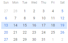
The result of highlighting a date range is given below:
Styling the Month control
You can customize the appearance of the Month view: specify the necessary size of calendar cells, adjust the padding and alignment for rendering of days. Specify the desired style settings via the custom_size CSS class. The example below shows how you can apply custom style to change the size of a calendar month.
<div class="demo-box custom_size">
  <Month current={new Date(2022, 2, 18)} />
</div>

<style>
  .custom_size {
    --wx-calendar-cell-size: 64px;
  }
  .custom_size :global(.days .day) {
    padding: 3px;
    align-items: start;
    justify-content: left;
  }
  .custom_size :global(.weekdays .weekday) {
    padding: 3px;
    text-align: left;
  }
</style>
As a result, the stylized month will look like this:

Related sample: Month view