ContextMenu
The Context Menu, also known as a right-click menu, appears when users right-click on an element. It offers a contextual list of options relevant to the selected element. This type of menu can be used to provide additional functionality or actions specific to the selected item.
Related resources
- Get the widget by installing the
@svar-ui/svelte-menupackage. - Check ContextMenu API Reference to see the list of configuration properties and events.
- Explore the samples to visualize the available features.
Initialization
To create a ContextMenu on a page, complete the following steps:
- Import the source file of the ContextMenu widget on a page:
<script>
  import { ContextMenu } from "@svar-ui/svelte-menu";
</script>
- Apply the
<ContextMenu>tag to initialize a context menu
<ContextMenu />
- Load a data set with options into the menu:
<ContextMenu {options} />
- Make sure you apply a theme if you use the ContextMenu component standalone. Please, refer to applying a theme for more information.
<Willow>
  <ContextMenu {options}/>
</Willow>
Loading options
Options can be loaded into ContextMenu on its initialization or after it. To begin with, you need to define a data set in the JSON format.
Specifying a data set
A data set will contain options of the Context Menu. You need to specify them as objects with attributes presented as key:value pairs. A data set for ContextMenu can have both a plain structure and a more complex one - tree-like structure.
- a plain data set structure looks like this:
const options = [
    { id: "cut-task", text: "Cut", icon: "wxi wxi-content-cut" },
    { id: "copy-task", text: "Copy", icon: "wxi wxi-content-copy" },
    { id: "paste-task", text: "Paste", icon: "wxi wxi-content-paste" }
]
- a tree-like data set structure is the following:
var options = [
    { id: "task-actions", text: "Task Actions", data:[
        { id: "cut-task", text: "Cut", icon: "wxi wxi-content-cut" },
        { id: "copy-task", text: "Copy", icon: "wxi wxi-content-copy" },
        { id: "paste-task", text: "Paste", icon: "wxi wxi-content-paste" },
        {
            id: "move-task",
            text: "Move",
            icon:"wxi wxi-empty",
            data: [
                { id: "move-task:up", text: "Up" },
                { id: "move-task:down", text: "Down" },
            ]
        },
    ]}
];
Menu item object structure
A menu item object may contain a set of properties, they are listed below:
- id - the id of a menu item
- text - the text of a menu item
- subtext - a dimmed text displayed to the right of the main item's text, such as a hot key or other additional info
- icon - the name of an icon displayed before the text. It converts to adding
<i class={item.icon}>, so any icons with thewxi-prefix can be used here, e.g ".wxi-plus" or any custom icons defined on the page. Read more about the usage of icons - css - the name of a CSS class that will be applied to an item to change its style
- type - the type of an item. It can be a "separator" or a custom type registered as a menu item (e.g. type:"button)
- data - an array of sub-items for a menu item. Used to create a tree-like menu structure
Loading options on initialization
To load a prepared data set on initialization of the Context Menu, you should use the options property:
<script>
    const options = [
        { id: "cut-task", text: "Cut", icon: "wxi wxi-content-cut" },
        { id: "copy-task", text: "Copy", icon: "wxi wxi-content-copy" },
        { id: "paste-task", text: "Paste", icon: "wxi wxi-content-paste" }
    ]
</script>

<ContextMenu {options} />
Loading options after initialization
You can load options into ContextMenu after its initialization from a separate JS file. These are the steps to follow:
- prepare a file with data ("data.js") in the same directory where your application is placed
- specify a function that will return an array of menu options in the data file and export this function to make it available from outside:
export function getOptions(){
    return [
        { id: "edit-task",text: "Edit",icon: "wxi wxi-edit" },
        {  id: "cut-task", text: "Cut", icon: "wxi wxi-content-cut" },
        {  id: "copy-task", text: "Copy", icon: "wxi wxi-content-copy" },
        {  id: "paste-task", text: "Paste", icon: "wxi wxi-content-paste" },
        {
            id: "move-task",
            text: "Move",
            icon:"wxi wxi-empty",
            data: [
                { id: "move-task:up", text: "Up" },
                { id: "move-task:down", text: "Down" },
            ]
        }
    ]
}
- import the function into your application and assign it to the variable specified for options
- use the options configuration property in the
<ContextMenu>tag. Set the name of the variable as its value or use the shorthand, if the name of the variable coincides with the name of the property:
<script>
    import { ContextMenu } from "@svar-ui/svelte-menu";

    import { getOptions} from "./data";

    const options = getOptions();
</script>

<ContextMenu {options} />
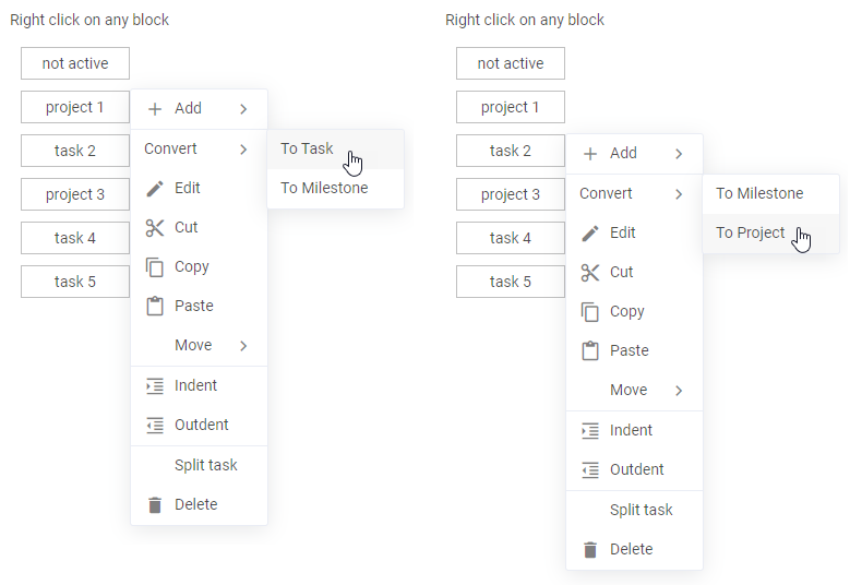
Related sample: Context Menu
Adding custom options
Creating a menu item
You can use a custom component inside of a ContextMenu item. To add a custom menu item, you need to create a file that will contain the code of your item, for example:
<script>
    import { Button, Text } from "@svar-ui/svelte-core";
    export let item;
</script>

<div>
    <div style="width: 120px" onclick|preventDefault>
        <Text placeholder={item.name} />
    </div>

    <Button icon="wxi-plus" type="primary" />
</div>
By default, clicking anywhere inside of a custom item component will activate menu closing and the click handler triggering. You can prevent it by intercepting the click event and using the preventDefault() method as in the above example.
Related sample: Context menu for items
Registering the item
When a component is ready, you should register it like this:
<script>
    import { Button} from "@svar-ui/svelte-core";
    import { ContextMenu } from "@svar-ui/svelte-menu";

    import ButtonMenuOption from "./your_items/ButtonMenuOption.svelte";
    import { registerMenuItem } from "../your_sources/helpers";
    registerMenuItem("button", ButtonMenuOption);
</script>
The above code has added the type:button component.
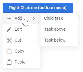
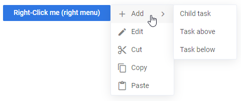
Using the item as ContextMenu option
Now you can use the newly created item in the options configuration. A custom "Add New" button is added into the menu below:
<script>
    // applying a newly registered menu item type for an option
    const options = [
        { id:1, text:"Add User", subtext:"Ctrl+A" },
        { id:2, text:"Refresh", subtext:"Ctrl+R" },
        { id:3, text:"Delete User", css:"danger" },
        { id:"btn", type:"button", name:"Add New" }
    ];
</script>

<ContextMenu {options} onclick={clicked} at="right">
    <Button type="primary">Right-Click me</Button>
</ContextMenu>
The result of adding a custom option into the menu is given below:
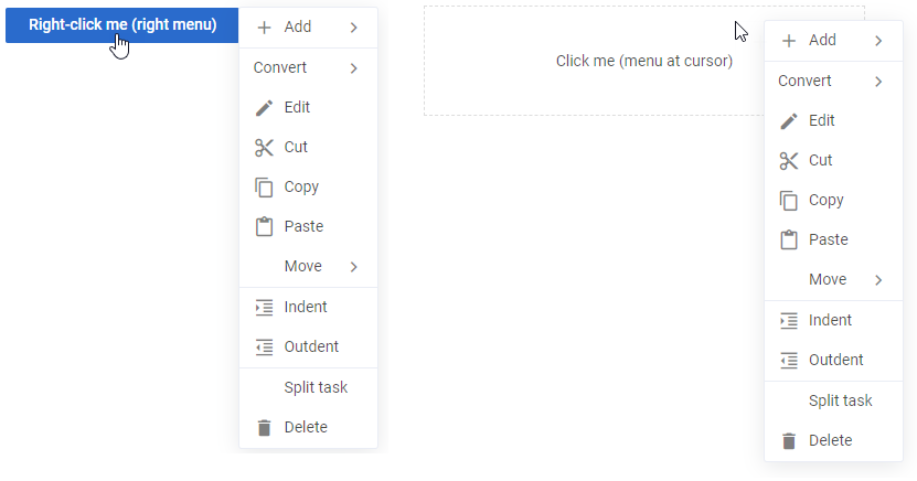
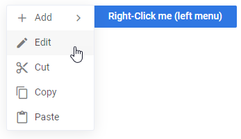
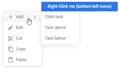
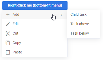
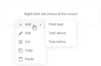
Setting the position of ContextMenu
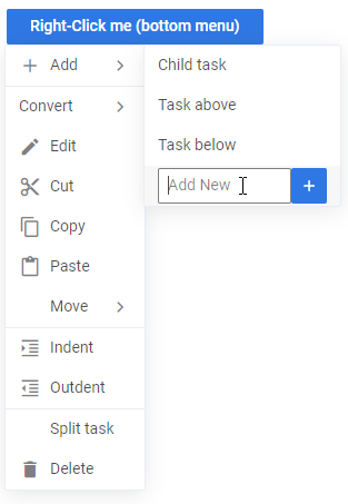
ContextMenu can be used the same as DropDownMenu for a button-like element. Wrap the element in the <ContextMenu> tag and specify the at property if you want to change the default ("bottom") position of the menu showing:
<ContextMenu {options} onclick={clicked} at="point">

    <Button type="primary">Right-Click me (right menu)</Button>

</ContextMenu>
The at property can have one of the values listed below:
- "bottom" - (default) a menu appears below the target node, left borders aligned (the menu goes to the right of the action area)
- "right" - a menu appears right to the target node
- "left" - a menu appears left to the target node
- "bottom-left" - a menu appears below the target node, right borders aligned (the menu goes to the left of the action area)
- "bottom-fit" - a menu appears below the target node, the width of the menu is equal to the width of the target node
- "point" - a menu appears at the specified left/top position and ignores the provided node
Related sample: Context menu
Using ContextMenu for multiple targets
It is possible to use ContextMenu for multiple active areas. The key point of this feature is the resolver property of the widget. It enables the multi-area mode and the associated function will be called before opening the menu. The logic inside of this method is able to decide whether a context menu is necessary. You can specify what context to show for several areas - the same or different.
Common context for different targets
In the example below ContextMenu will appear for all items with the data-context-id attribute:
<script>
    function getItem(id){
        return items.find(a => a.id == id);
    }
</script>

<ContextMenu {options} resolver={getItem}>
    {#each items as item(item.id)}
        <div data-context-id={item.id} class="item">{item.type} {item.id}</div>
    {/each}
</ContextMenu>
The result of the resolver call will be provided in the resulting click event as ev.detail.item.
Check the examples of valid resolvers below:
const allowAll = (id, ev) => true;
const allowElementsWithCorrectAttribute = (id, ev) => return id;
const allowAndReturnTaskObject = (id, ev) => return tasks[id];
The id inside the resolver is the value of the data-context-id attribute. It can be redefined with the help of the dataKey property like this:
<ContextMenu dataKey="dataId" />
    <div data-id="1"></div>
Related sample: ContextData
Different context for different targets
In the multi-area mode ContextMenu can be configured to show different items for different targets.
It can be done by defining the filter property which will be a function similar to filterMenu() in the example below:
<script>
    const filterMenu = (menuItem, task) => {
        // hide the "delete" item for projects
        if (menuItem.id === "delete" && task.type === "project") return false;
        return true;
    }
</script>

<ContextMenu {options} resolver={getTasks} filter={filterMenu}>
In the above example:
- menuItem - a single record from the options collection
- task - the result of the resolver (getTasks()) function call
Related sample: ContextData
Custom triggering of ContextMenu
You can use ContextMenu with a custom trigger that will allow you to show the menu anywhere and whenever you need.
You can perform custom triggering in two possible ways:
- triggering via the data-context-id with the context as its value and the resolver function to match the context (please, refer to Common context for different targets)
- calling the show function and passing the context to it as the second attribute
To manually control when to show the menu, you should call menu.show(ev, i). But first, you should get the menu object with available functions using the bind Svelte feature. Currently, the show function is available, which you can link to an HTML element.
<script>
    let menu = $state();
</script>

<ContextMenu {options} bind:this={menu}>
    <div onclick={menu.show}></div>
</ContextMenu>
Besides, the click event, you can use oncontextmenu or any other DOM event as well. It is also possible to show ContextMenu from a custom code. It is important that the first argument will be an object that contains a target or the clientX/clientY coordinates. For example:
// showing a menu manually with a DOM event
menu.show(ev);

// or with a "fake" event related to the node
menu.show({ target: DOMTarget });
// at a specific position
menu.show({ clientX: 100, clientY: 100 });

//if necessary the function can receive the related item as well
//this value will be passed to the resolver function, if it is defined, and to the click event handler
//the click event will get the item as context
menu.show(ev, item);
Disabling a menu option
You can disable individual context menu items by adding the disabled property to the corresponding item in the options array.
<script>
  import { ContextMenu } from "@svar-ui/svelte-core";

  const options = [
    { id: "cut-task", text: "Cut", icon: "wxi wxi-content-cut" },
    { id: "copy-task", text: "Copy", disabled: true }, // disabled item
    { id: "paste-task", text: "Paste", icon: "wxi wxi-content-paste" }
  ];
</script>

<ContextMenu {options} />
Catching the change of a clicked option
You can catch the change of a clicked option by handling the click event. Inside the event you can get an object of the clicked option as in:
<script>
    function clicked(ev){
        const action = ev.action;
        message = action ? `clicked on ${action.id}` : "closed";
    }
</script>

<ContextMenu {options} onclick={clicked} at="left">
    <Button type="primary">Right-Click me</Button>
</ContextMenu>
The action property of event object will contain an object related to the clicked menu item.
Related sample: Context Menu
Styling an item of ContextMenu
You can apply a particular style to a menu item via the css attribute of an item object. Use the global keyword while specifying a style to reach an isolated menu item. In the example below, the text of the third menu option turns red:
<script>
    const options = [
        { id:1, text:"Add User", subtext:"Ctrl+A" },
        { id:2, text:"Refresh", subtext:"Ctrl+R" },
        { id:3, text:"Delete User", css:"my-color" }
    ];
</script>

<ContextMenu {options} at="bottom" >
    <Button type="primary" onclick={showMenu}>Right-Click me</Button>
</ContextMenu>

<style>
    :global(.item.my-color span){
        color: red;
    }
</style>
As a result, the menu will look like this:
