Basic Menu
The Basic Menu is a simple yet versatile menu type that displays a list of options in a hierarchical structure. It allows users to navigate through different sections of an app or perform actions by selecting menu items. This type of Menu depends on the parent object and should be used together with the inner Portal component that allows taking a menu out of the Svelte app structure and put it at any place of the app.
Related resources
- Get the widget by installing the
@svar-ui/svelte-menupackage. - Check Menu API Reference to see the list of configuration properties and events.
- Explore the samples to visualize the available features.
Initialization
To create a Menu instance on a page, you need to complete several steps:
- Import the source file of the Menu widget on a page:
<script>
  import { Menu } from "@svar-ui/svelte-menu";
</script>
- Apply the
<Menu>tag to initialize a menu:
<Menu />
- Load a data set with options into the menu:
<Menu {options}/>
- Make sure you apply a theme if you use the Menu component standalone. Please, refer to applying a theme for more information.
<Willow>
  <Menu {options}/>
</Willow>
Loading options
Options can be loaded into Menu on its initialization or after it. To begin with, you need to define a data set in the JSON format.
Specifying a data set
A data set will contain Menu options. You need to specify them as objects with attributes presented as key:value pairs. A data set for Menu can have both a plain structure and a more complex one - tree-like structure.
- a plain data set structure:
var options = [
    { id: "add-task:child", text: "Child task" },
    { id: "add-task:above", text: "Task above" },
    { id: "add-task:below", text: "Task below" },
];
- a tree-like data set structure:
var options = [
    { id: "add-task", text: "Add", icon: "wxi wxi-plus", data:[
        { id: "child", text: "Child task" },
        { id: "above", text: "Task above" },
        { id: "below", text: "Task below" }
    ]}
];
Loading options on initialization
To load a prepared data set on initialization of Menu, you should use the options property:
<script>
  const options = [
      { id: "add-task:child", text: "Child task" },
      { id: "add-task:above", text: "Task above" },
      { id: "add-task:below", text: "Task below" },
  ];
</script>

<Menu {options}/>
Loading options after initialization
You can load options into Menu after its initialization from a separate JS file. These are the steps to follow:
- prepare a file with data ("data.js") in the same directory where your application is placed
- specify a function that will return an array of menu options in the data file and export this function to make it available from outside:
export function getProjects(){
  return [
    { id:"a", text:"Project A" },
    { id:"b", text:"Project B" },
    { id:"c", text:"Project C" },
    { id:"d", text:"Project D" }
  ]
}
- import the function into your application and assign it to the variable specified for options
- use the options configuration property in the
<Menu>tag. Set the name of the variable as its value or use the shorthand, if the name of the variable coincides with the name of the property:
<script>
  import { Menu } from "@svar-ui/svelte-menu";

  import { getProjects } from "./your_data";

  const options = getProjects();
</script>

<Menu {options} />
Related sample: Menu basic
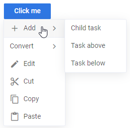
Adding custom options
Creating a menu item
You can use a custom component inside of a Menu item. To add a custom menu item, you need to create a file that will contain the code of your item, for example:
<script>
    import { Button, Text } from "@svar-ui/svelte-core";
    export let item;
</script>

<div>
    <div style="width: 120px" onclick|preventDefault>
        <Text placeholder={item.name} />
    </div>

    <Button icon="wxi-plus" type="primary" />
</div>
By default, clicking anywhere inside of a custom item component will activate menu closing and the click handler triggering. You can prevent it by intercepting the click event and using the preventDefault() method as in the above example.
Registering the item
When a component is ready, you should register it like this:
<script>
  import { Button, Portal } from "@svar-ui/svelte-core";
  import { Menu } from "@svar-ui/svelte-menu";

  import ButtonMenuOptionfrom "./your_items/ButtonMenuOption.svelte";
  import { registerMenuItem } from "../your_sources/helpers";
  registerMenuItem("button", ButtonMenuItem);
</script>
The above code has added the type:"button" component.
Using the item as Menu option
Now you can use the newly created item in the options configuration. A custom "Add New" button is added into the menu below:
<script>
  // applying a newly registered menu item type for an option
  const options = [
    { id:1, text:"Add User", subtext:"Ctrl+A" },
    { id:2, text:"Refresh", subtext:"Ctrl+R" },
    { id:3, text:"Delete User", css:"danger" },
    { id:"btn", type:"button", name:"Add New" }
  ];
</script>

<Button type="primary">Click me</Button>
  {#if menu1}
  <Portal>
    <Menu {options} parent={menu1}></Menu>
  </Portal>
  {/if}
The result of adding a custom option into the menu is given below:

Related sample: Custom options
Setting the parent of Menu
You can specify an optional HTML element as a Menu parent. Then use the parent property to link a menu to its parent. For example, a button can be used as a menu parent:
<script>
  let menu1 = null;
</script>

<Button type="primary" onclick={ev => menu1 = ev}>Click me</Button>

{#if menu1}
  <Portal>
    <Menu {options} parent={menu1} onclick={clicked}></Menu>
  </Portal>
{/if}
In the above example a menu is wrapped into the Portal component. It allows taking Menu out of the strict Svelte code structure and put it anywhere you need in the app.
Related sample: Menu basic
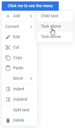
Setting the position of Menu
Relative positioning
You can control the position of Menu relative to the target via the at property. In the example below Menu appears to the right of the target:
<script>
  import { Button, Portal } from "@svar-ui/svelte-core";
  import { Menu } from "@svar-ui/svelte-menu";

  let menu2 = null;
</script>

<Button type="primary" onclick={ev => menu2 = ev}>Click me</Button>

{#if menu2}
  <Portal>
    <Menu {options} parent={menu2} onclick={clicked} at={"right"}></Menu>
  </Portal>
{/if}
Related sample: Menu basic
The at property can have one of the values listed below:
- "bottom" - (default) a menu appears below the target node, left borders aligned (the menu goes to the right of the action area)
- "right" - a menu appears right to the target node
- "left" - a menu appears left to the target node

- "bottom-left" - a menu appears below the target node, right borders aligned (the menu goes to the left of the action area)
- "bottom-fit" - a menu appears below the target node, the width of the menu is equal to the width of the target node
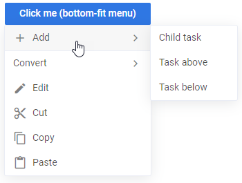
- "point" - a menu appears at the specified left/top position and ignores the provided node
Absolute positioning
You can show Menu at some particular coordinates on a page. There are left and top properties you should specify for this purpose. The values of these configs should be set in pixels. For example:
<Menu {options} left={100} top={200}>
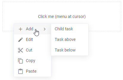
Related sample: Menu basic
Catching the change of a clicked option
You can catch the change of a clicked option by handling the click event. Inside the event you can get an object of the clicked option as in:
<script>
  let menu1 = null;

    let message = "";
    function clicked(ev){
        const action = ev.action;
        message = action ? `clicked on ${action.id}` : "closed";
        menu1  = null;
    }
</script>

<div>{message}</div>

<div>
  <Button type="primary" onclick={ev => menu1 = ev.target}>Click me (bottom menu)</Button>
  {#if menu1}
  <Portal>
    <Menu {options} parent={menu1} onclick={clicked}></Menu>
  </Portal>
  {/if}
</div>
When a user clicks outside the menu, the ev.action of the generated click event will be null.
Related sample: Menu basic
Disabling a menu option
You can disable individual menu items by setting the disabled property directly in the options array. Submenus (data) can also contain disabled items
<script>
  import { Menu } from "@svar-ui/svelte-core";

  const options = [
    { id: "open", text: "Open" },
    { id: "edit", text: "Edit", disabled: true }, // disabled menu item
    { id: "delete", text: "Delete" }
  ];
</script>

<Menu {options} />
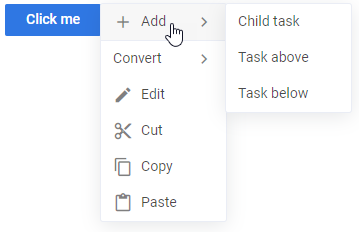
Styling a Menu item
You can apply a particular style to a menu item via the css attribute of the options property. Use the global keyword while specifying a style to reach an isolated menu item. In the example below, the text of the third menu option turns red:
<script>
  const options = [
    { id:1, text:"Add User", subtext:"Ctrl+A" },
    { id:2, text:"Refresh", subtext:"Ctrl+R" },
    { id:3, text:"Delete User", css:"my-color" }
  ];

  let menu1 = null;
</script>

<Button type="primary">Click me</Button>
  {#if menu1}
  <Portal>
    <Menu {options} parent={menu1}></Menu>
  </Portal>
  {/if}

<style>
  :global(.item.my-color span){
    color: red;
  }
</style>
As a result, the menu will look like this:

Related sample: Item styling
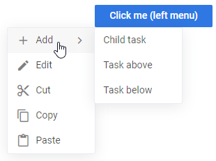
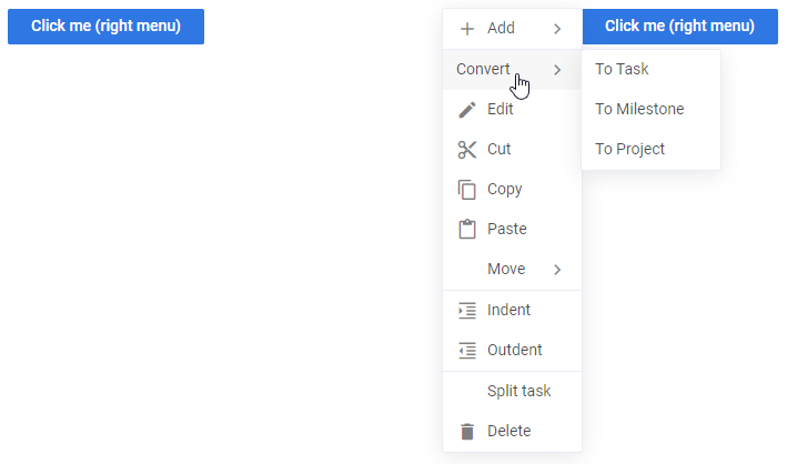
How to adjust Menu position to fit the page
In case there isn't enough space on a page for Menu, you can adjust the Menu configuration so that it will appear at the position that allows fitting in the page:
- wrap the menu into the Portal component to extract the menu from the hierarchical structure of Svelte and specify the mount variable to bind the Portal to the menu
- specify the
mountproperty in the menu config
<script>
  import { Portal } from "@svar-ui/svelte-core";
  import { Menu } from "@svar-ui/svelte-menu";
</script>

<Portal>{#snippet children(mount)}
  <Menu {options} {mount}></Menu>
{/snippet}</Portal>
The mount handler attaches the menu to a custom portal making it possible to show menu at the most suitable position to fit in the page. In the example below the second right menu will appear from the left of the button, since there isn't enough space from the right part of the button:
<div>
  <Button type="primary" onclick={ev => menu2 = ev}>Click me (right menu)</Button>

  {#if menu2}
  <Portal>{#snippet children(mount)}
    <Menu {options} parent={menu2} onclick={clicked} at={"right"} {mount}></Menu>
  {/snippet}</Portal>
  {/if}

  <Button type="primary" onclick={ev => menu2 = ev}>Click me (right menu)</Button>
</div>
Related sample: Auto fit