Styling
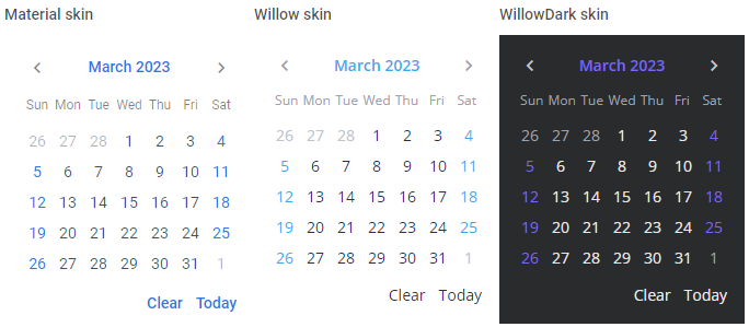
The SVAR library provides you with the next predefined skins to make your application look stylish and up-to-date: Willow and WillowDark

Related sample: Calendar Willow skin
Related sample: Calendar WillowDark skin
It is important to apply one of the skins to a control. Otherwise, it won't be rendered correctly.
Using skins
The code of each skin is provided in a separate Svelte file. You should include the source file of the chosen skin into the <script> part of the app:
<script>
  import { Willow } from "@svar-ui/svelte-core";
</script>
After you've included the desired skin and a control on a page, you need to wrap the control in the skin's tags like this:
<script>
  import { Calendar, Willow } from "@svar-ui/svelte-core";
</script>

<div style="width:300px">
  <Willow>
    <Calendar />
  </Willow>
</div>
Using different skins for control instances
In case you need to render several instances of a control, each of which has its own skin applied, you should wrap each of them in the tags of a corresponding skin.
Don't forget to include all the applied skins on the app's page.
<script>
  import { Calendar, Willow, WillowDark } from "@svar-ui/svelte-core";
</script>

<div class="demo-box" style="width: 350px; display: flex; flex-direction: row;">
  <Willow>
      <Calendar />
  </Willow>
  <WillowDark>
      <Calendar />
  </WillowDark>
</div>

Related sample: Calendar Willow skin
Related sample: Calendar WillowDark skin
Disabling fonts
Whenever you need to disable the fonts used in a skin, you can make use of the fonts property of the skin and set it to the false value:
<script>
  import { Calendar, Willow } from "@svar-ui/svelte-core";
</script>

<div style="width:300px">
  <Willow fonts={false}>
    <Calendar />
  </Willow>
</div>
Please note that if you switch the default fonts off, you will have to include the fonts you need by yourself.